Case study · Shipped product · Retail
Family Dollar
A ground-up redesign of the mobile shopping experience for budget-conscious families — told through its hardest problem:the cart.
- Role
- Product Designer & UX Consultant (in-house)
- Team
- Engineering · Product · Marketing
- Focus
- Cart · Checkout · Coupons · Fulfillment
Overview
The Problem
Family Dollar's existing app had real usability problems and an outdated interface: confusing navigation, high-friction coupon management, weak mobile usability, and a checkout flow that leaked shoppers at every step. The redesign's goal was an intuitive mobile experience that supports everyday shopping — clearer navigation, modern standards, and faster paths from need to purchase.
For shoppers on tight budgets, every extra step between a coupon and a saved dollar is a reason to leave. So instead of adding features, we removed friction — and measured whether it worked.
The cart was one of several workstreams I contributed to across the app. This case study follows it end-to-end because it carried the highest business stakes.
Discover
Research before pixels
We combined competitive analysis, user interviews, and usability testing to understand both shopper needs and industry patterns — deep dives into leading e-commerce apps, paired with direct user feedback, to find the pain points worth fixing first.
Primary persona · composite from user interviews
Tanya, 34 — the time-strapped essentials shopper
A mother of two working two jobs. She shops on her phone between shifts, knows exactly what her family needs, and has every dollar accounted for. She's comfortable with technology — and impatient with anything that wastes her time.
She needs
- Quick, immediate purchases over browsing an overwhelming store
- Certainty: real totals, real savings, no surprises at checkout
- Flexibility — pick up some items today, ship the rest
What that meant for the design
- Fewest possible steps from coupon to saved dollar
- One consolidated order summary — never make her do math
- Fulfillment choices per item, not per order
Competitive teardown: four carts, four lessons
We audited the cart-to-checkout flows of four retailers. Each card ends with what we actually did about it — analysis is only useful if it changes the design.
Target
- Cart line items link back to product detail
- "Save for later" offered before checkout
- Transparent, itemized cost breakdown
- Cross-sell recommendations feel irrelevant
Adopted the cost transparency; kept cross-sell out of the critical path.
Walmart
- Shipping costs surfaced up front
- Auto-selects the cheapest fulfillment
- "Save for later" support
- No pickup cut-off times
- No geotargeting for the nearest store
- Rigid fulfillment editing
Surfaced pickup timing per item and gave shoppers per-item fulfillment control.
Dollar General
- Clear subtotal information
- Deals featured directly in the cart
- Pickup alternatives buried
- Irrelevant sponsored items
- No promo code entry
- Key information fragmented
Made promo entry visible in the cart and consolidated everything into one order summary.
Staples
- Strong visual hierarchy on section headers
- Third-party payment options placed well
- Delivery dates displayed early
- Hidden checkout steps add complexity
A hard rule for our flow: no hidden steps — every cost visible before checkout.
The journey, rebuilt
Six moments where carts live or die
Walk the flow the way Tanya does. Each stage shows what shoppers are trying to do, where the old experience failed them, and the decision that fixed it.
What she's doing
Evaluates the product: price, savings, availability at her store.
Where it used to fail
Small imagery, add-to-cart buried below the fold, savings unclear.
What we changed
Large, clear product imagery with a prominent add-to-cart action and price + savings communicated up front — built for quick comparison and fast purchase on a phone.
What she's doing
Commits to the item and keeps shopping.
Where it used to fail
No feedback after tapping — shoppers reopened the cart to verify it worked.
What we changed
Instant confirmation with a running subtotal, and coupons auto-checked against the item — "Coupon Applied" appears without the shopper hunting for it.
What she's doing
Reviews items, applies promo codes, chooses how each item arrives.
Where it used to fail
Key information was fragmented, promo entry was missing, and one fulfillment method was forced on the entire order.
What we changed
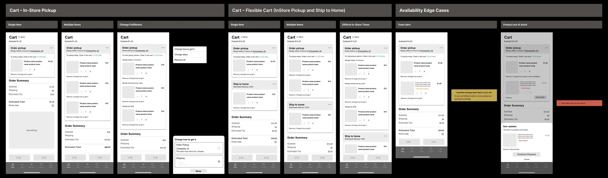
A flexible cart: items grouped by fulfillment (in-store pickup and ship-to-home living together), visible promo code entry with applied-code chips, and one consolidated order summary with the estimated total — no math left to the shopper.
- Add promo code
- Choose fulfillment
- Review total costs
What she's doing
Pays and confirms delivery details.
Where it used to fail
Surprise costs and hidden steps appeared here — the #1 abandonment point.
What we changed
Checkout introduces nothing new. Every cost, date, and fulfillment choice was already reviewed in the cart, and alternative payments sit one tap away.
What she's doing
Places the order.
Where it used to fail
"Did it go through?" — confirmation was slow and vague.
What we changed
Immediate confirmation with a per-fulfillment breakdown: what ships, what is waiting at the store, and when.
What she's doing
Checks on the order over the following days.
Where it used to fail
No post-purchase visibility — shoppers called stores to ask.
What we changed
A comprehensive order overview: items, fulfillment methods, current status, and easy access to tracking for both delivery and pickup progress.
Ideate
Half the wireframe wall is edge cases
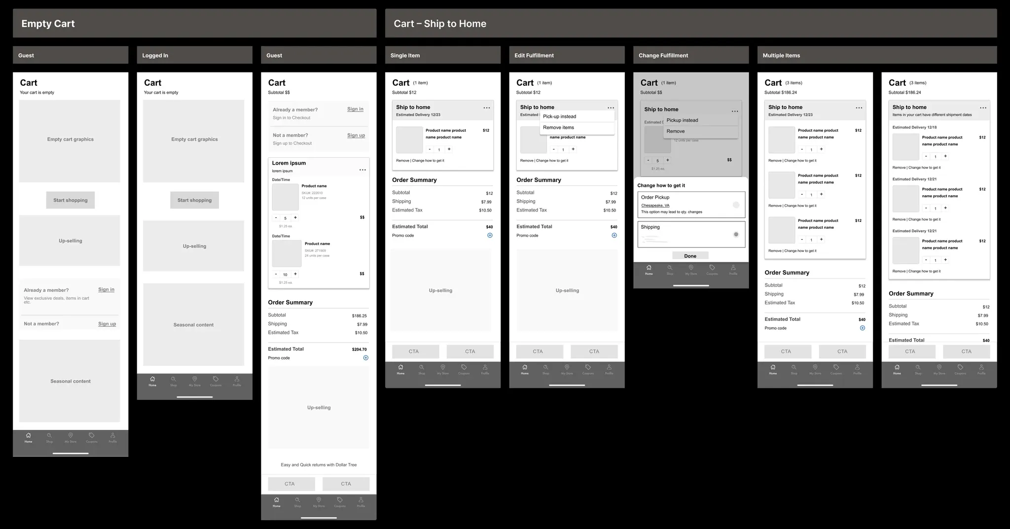
Carts don't fail on the happy path — they fail when an item goes out of stock, when a guest hits checkout, when pickup and shipping collide in one order. The mid-fi phase mapped those states first: empty carts, guest vs. signed-in, mixed fulfillment, substitutions, and quantity-change alerts.
Design
The cart, before and after
Scroll inside each phone to explore the full screens. The change isn't decoration — it's information architecture: everything Tanya needs to decide lives in one place, in the order she needs it.
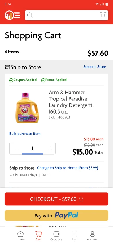
- One fulfillment method forced on the whole order
- Key information fragmented down the page
- No visible promo code entry
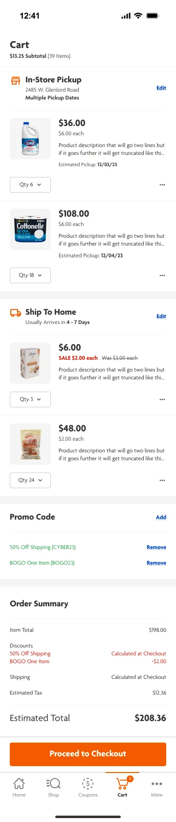
- Pickup and ship-to-home grouped in one flexible cart
- Promo codes visible, applied codes shown as removable chips
- One consolidated order summary with the estimated total
Shipped
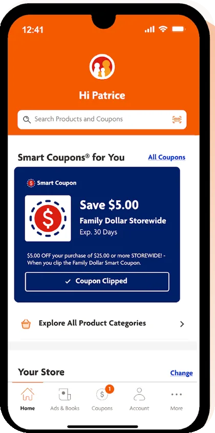
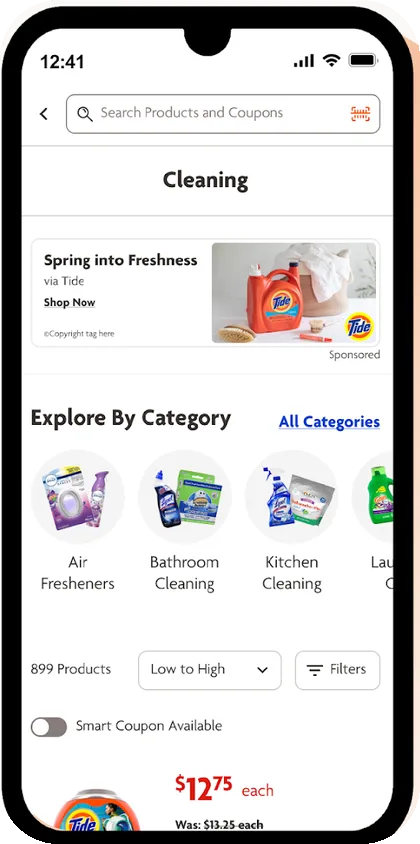
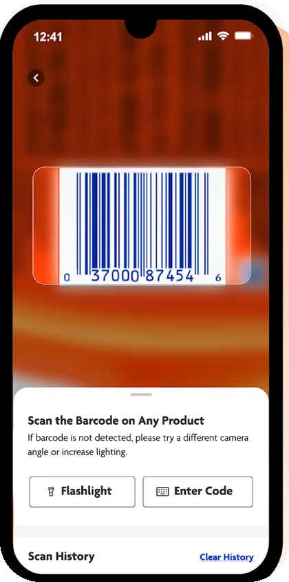
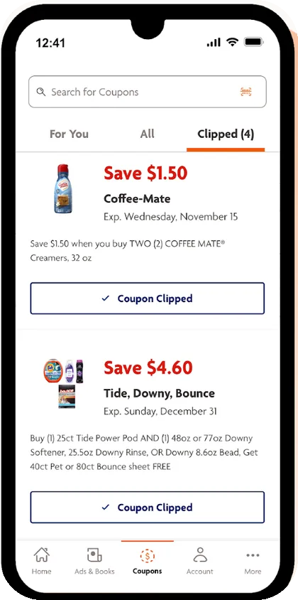
The shelf: decisions that made it to production
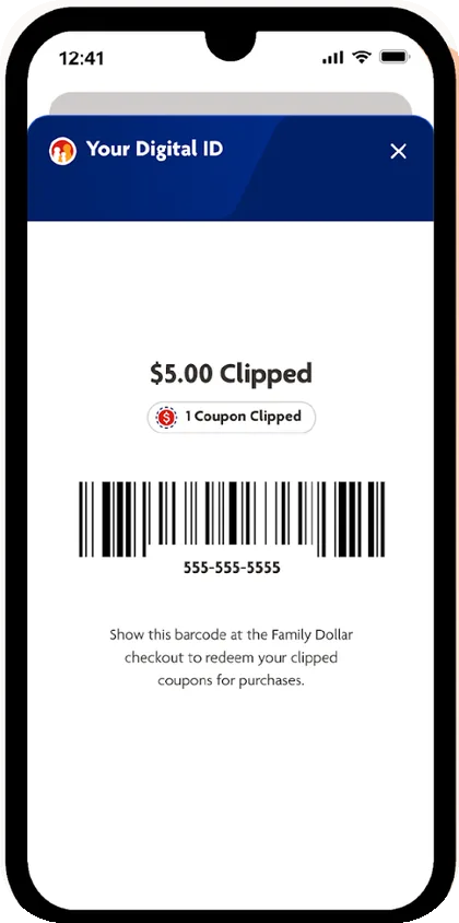
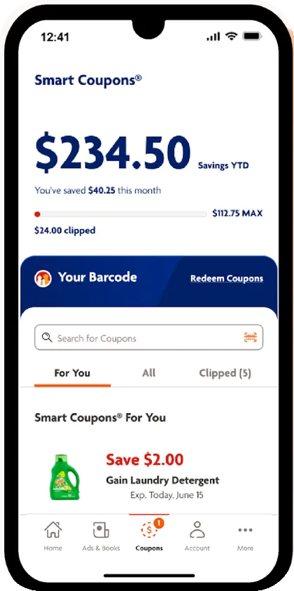
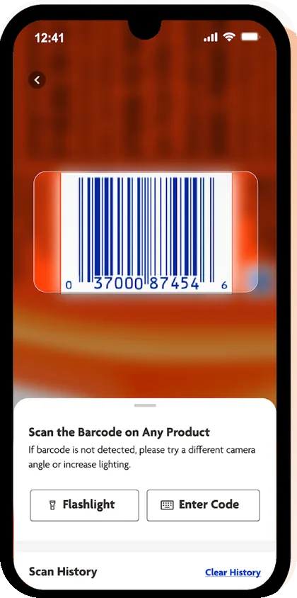
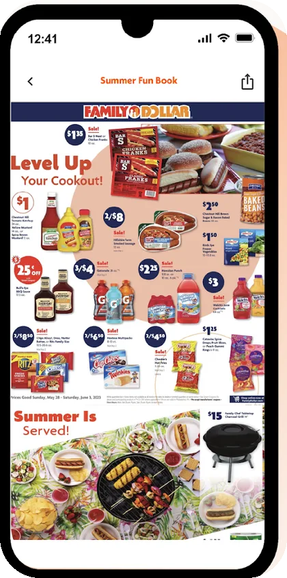
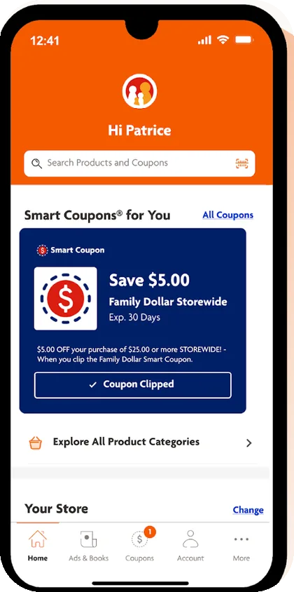
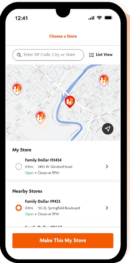
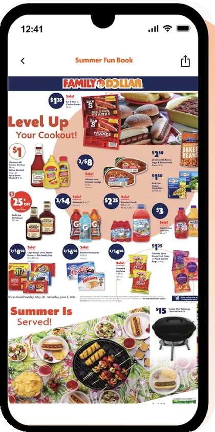
Browse the aisle — every screen ships with the decision it encodes.
Trade-offs
The hard calls
Process is table stakes. These are the decisions where reasonable people disagreed — and why we landed where we did.
The flexible cart almost got cut
Letting one order mix in-store pickup with ship-to-home was the most contested call of the project — engineering flagged the complexity, and honestly, they weren't wrong. I kept coming back to the interviews: our shoppers buy some things for tonight and let the rest wait. We kept it, and grouping items by fulfillment with their own dates is what made it survivable.
Where the up-sells went
Marketing wanted recommendations high in the cart, and it's a fair ask — that placement converts. But it converts by interrupting someone mid-purchase. We landed them below the order summary. Recommendations can earn a second trip through the cart; they don't get to tax the first one.
Showing the real total early
There was a case for hiding estimated tax and shipping until checkout — early totals look bigger and can scare people off. We showed them anyway. A surprise at the payment step is exactly what was killing conversions in the old flow, and for a shopper budgeting to the dollar, a number that moves is worse than a number that's big.
Polish lost to edge cases
With limited iteration time, animation polish got bumped for out-of-stock substitutions, quantity conflicts, and guest checkout. Nobody abandons a cart because a transition wasn't smooth. They abandon it when an item disappears and the app can't explain what happened.
Outcomes
What changed
Cart drop-off rate
Measured post-launch. Driven by the consolidated order summary, visible promo entry, and a checkout with no surprises left in it — directly lifting completed sales.
User retention
Measured post-launch. We attribute the lift to the savings tracker and coupon wallet — features that give shoppers a weekly reason to return — and to flexible fulfillment reducing failed trips.
What I'd measure next
Coupon redemption rate per session, the pickup cut-off "save rate" (orders rescued by same-day timing), and time-to-checkout for repeat shoppers. The 35% told us the cart worked — these would tell us which part of it to invest in next.